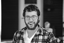
Monday, December 15, 2008

Final Post


Portrait.


Long Drawing of the Eye.


Skull Drawing, back 3/4 view.


Long Drawing of Model, since midterm.


Gesture.

I really enjoyed drawing my portrait, since it has been a really long time since I drew myself. I also have never drawn any portrait using charcoal, or in the size that I did on my portrait, so it was definitely a challenge for me.
Luckily for me, I feel that Life drawing has really helped my drawing skills, dramatically. Aside from not drawing my own portrait in a long time, I really haven't done much drawing for a few years. Every once in a while I would pick up my sketchbook, just to polish my skills. So, having another drawing class really helped there. I was drawing more between my Printmaking class, for ideas, and Life Drawing than I have in the last 2 years combined. So I really enjoyed the amount of work my hands were getting with drawing. I can totally feel my drawing skill getting better between the 2 classes, and I think that the most of that is coming from Life drawing.
These last few long poses, skull, eye, and portrait show evidence of that. One factor that has gotten better is my line work. The variation of the lines, especially in the long drawing of the model, really give my drawings a sense of depth, and put them in proper space.
Another aspect of my drawings that have improved would be the mark-making. In the portrait, and on the skull, I really feel like my marks really help to separate the planes. It also helped me describe the space much easier, without feeling like I have to get everything exact.
My knowledge of proportion and identifying the planes also improved to a higher level, which is evident in my portrait, and the gesture drawing.
As far as building the muscles on the maniken, I wasn't a huge fan of that. I somewhat reluctantly ground through each set of muscles that we built. I definitely see how knowledge of the muscles can help with the drawing, but I could only scarcely relate to me building them and how I drew them. I guess it just wasn't for me.
The thing I enjoy most about my maniken would be his killer, tough, full beard, which I found myself being jealous of more often than not.

Wednesday, December 3, 2008

Music Music Music.


I've been listening to music a lot recently. More so than normal. I guess if any of you knew me, you would know that that means I am listening to an insane amount of music, since I already engage in music listening on a fairly large basis. So when I say a lot, I mean I'll take around 5 albums, and listen to each one of them, all the way through, atleast 3 or 4 times a day.
Crazy, I know. But, I got reasons. Mostly because I simply enjoy furthering my musical tastes, and discovering new music. But, it is also the end of the year, and its time for me to decide my favorite, or "top" music of the year. I will usually write a small article of sorts on the albums/bands that I have chosen. I haven't got that far yet, but here is a bit of what I've been listening to in the last couple of days. The first two albums are in my consideration for favorites of 2008, while the final selection is much older.
Most of you have probably heard the singer on this album sing before, though not in a traditional music setting. If you have seen the movie "Elf," then you have heard the wonderful voice of Zooey Deschanel. Deschanel, the "She" of the title, is accompanied by the "Him," of folk/country act M. Ward. Though Deschanel takes most of the album, as she does almost all vocals, and wrote most of the songs, M. Ward provides great arrangements, solid piano rythms, and excellent backing vocals. The sound itself is very pop, with a lot of soul. It is very Shangri-Las, or Gram Parsons, and drives off influences from classic California pop music of the 60s. Standouts include the Smoky Robinson cover, "You Really Gotta Hold On Me," and "I Thought I Saw You're Face Today." For all that, the music can be sort of simple, and mediocre at times. But the fact that Deschanel has such a great voice, and the tracks are all still rather entertaining makes this album worthwhile.
Will Oldham has been consistently releasing great folk music for some time now. He also usually sports a killer beard. And with the right amount of vocal harmony, steady guitar licks, and a proper dose of beard, Oldham releases stellar music under the moniker Bonnie 'Prince' Billy. This album, his most recent to date is no exception. It is much lighter than his other stuff, in that generally much more upbeat, and less haunting, which is a nice change. This album is warm, enchanting, and did I mention he has a beard?
Not much to say about Leonard Cohen, other than he is one of those songwriters that everyone should listen to, if at least even heard of. The cold fact there is that, though many of you may not have heard of him, I can almost guarantee that you have heard one of his songs. Probably the most popular of what he has wrote has been featured in TV shows, movies, and the like. Popularized by artists such as Rufus Wainwright, Jeff Buckley, and many others, the song "Hallelujiah" that found its way into film and television shows, was originally written and performed by Leonard Cohen. Cohen has a great repertoire of folk and classic stylings. His dark, deep voice is the driving force for much of his recordings, and his lyrics are grave and enlightening at the same time. Along with his raw presentation and recording, these things come together to form music worth the music of many ages.


Thursday, November 13, 2008

Blog

As far as the blog process goes, I'm not really sure how I feel about it.
On one hand, its a great way to easily display progress, but it can be sort of frustrating to scan/take pictures of all your work and then upload it and all that.
It is definitely a different technique to the traditional critiques and reviews that we get in most classes. One thing that catches my attention most when it comes to blogging is the pictures/photos. I like looking at those much more than actually reading what the student has to say, especially if its a lot of text.
So blogging has its benefits, because it is something a lot of us have never done, and it is pretty simple, but it can also be a bit of a hassle...

Long Drawings


This was one of the first long drawings that we did in class, and I enjoy the simplicity of it.
The line work in it is another part that I feel I did well. I also used the long axis lines in this drawing in a way that really show how the model was positioned.

For this drawing, the difficult part was getting the foreshortening of the right leg. I had to use the negative space to find the forms, and then fill in the positive. I think this one does a good job showing the landmarks. The weakest part of this drawing would probably be the line work. There is not much variation, but the values are pretty evident.

Hour Long
I think this is one of the better drawings I have done. Many of the landmarks on the model are shown. Composition wise, this drawing fit well on the paper, along with a good portion of the figure. The thing that I think makes this one stand out is the mark making and the lines. The left side of the body is shown in more detail and with heavier lines, and the far, right side is left ligher and slightly blurred

Monday, November 10, 2008

Photography


I've been doing a lot of photography lately, in fact, I bought a Canon EOS Digital Rebel Xsi just about a month ago. Along with that, my older, Nikon 7600 Point and Shoot, and various pinholes, I have just been having a wonderful time. The pinhole that I used was the paint can pinhole that was used in Exploring Photography, but since I don't have a dark room, I haven't been able to do much with that lately.

So I started researching making pinholes that I can use film with, and then get the film developed from Walgreens or whatever. So I made a pinhole camera out of a matchbox. Directions can be found here, if you're interested in trying it yourself : http://www.matchboxpinhole.com/
Unfortunately, the roll I took with it did not turn out. There was information on the film, but no visible pictures. I think it was because I was not sure how much to roll the film after each shot, so I was probably getting double or maybe even triple exposures, causing utter chaos on the film.

Another option, that I haven't tried yet is the Dirkon Paper Camera. From the website (http://www.pinhole.cz/en/pinholecameras/dirkon_01.html) you can download a PDF file that you must print out on cardstock, and then cut along the dotted lines, and construct this paper camera. This one looks a lot more complicated than the matchbox camera, but also a lot cooler.

Most people think I'm crazy to waste my time building cameras. They say "Ryan, you have a really high quality, DSLR that you spent a lot of money on and it takes incredibly good pictures, why would you spend maybe five dollars on supplies and waste time to make a camera where the results are not gonna be as good quality, or there might not even be results." Well, its all about the process, I say. Making the camera is fun, and also, you need to be real careful when making the actual pinhole, and you need to make sure the box or can or whatever is light-proof. Yes, I love my digital camera. More than a lot of things. I know exactly what I'm going to get when I hit that shutter button, and I can change basically anything I want in the camera's settings, or in the lens, to get nice quality images. On the other hand, there is something that I find really thrilling in building your own camera, and then pointing it at something, hoping the pinhole will capture it, and that the exposure that you guessed is correct, so the image is not blown out or underexposed. So I guess it's all about the mystery. The lack of ability to predict what is going to go through that pinhole, and whats going to happen to the light inside the can or box. Is there going to be some strange blurring, or obscure light flares? Where is the focus going to be the most prominent? Its all a complete mystery, but if all those things work together in such a raw application of photography, what normally would be a normal, boring, static shot, could turn into an interesting masterpiece of a shot.

Here are a few links from the post, plust a few photography sites that I enjoy:
http://www.matchboxpinhole.com/ - Matchbox Pinhole
http://www.pinhole.cz/en/pinholecameras/dirkon_01.html - Dirkon Paper Camera
http://peterbaker.net/photos/afterhours/ - Peter Baker Photography. I especially enjoy the "After Hours" gallery...great night shots.
http://www.jamespomerantz.com/main.php - Great photojournalism shots from James Pomerantz
And here is a site where I have some of my photography. Most of the photography is done with my Canon. Some of the earlier photographs are from my Nikon. I haven't had a chance to upload my pinhole shots to the site yet, but eventually will.
http://thinoxygen.deviantart.com/gallery/

Skeleton


Here is the long pose of the skeleton we did. Though it is really tall and skinny, I think that the proportions are all pretty good. Plus I enjoy how the ribcage looks with the spine behind it. I used different line weights to show the space in between there. I think this is one of my best drawings of the skeleton, and I even drew a helmet on the skeleton, as if he was a warrior in the army of death.

Best Gestures.


This is a quick gesture drawing of the skeleton. It shows all the landmarks. The emphasis of this drawing was the ribcage, but the other landmarks are shown on the drawing. The whole figure is there, along with the axis lines of the spine, arms, and legs. As the emphasis was on the rib cage, that is the darkest part of the drawings, with lighter, tapered weights being used on the rest of the figure.

30 seconds:
This was a thirty second gesture drawing. The closer features are darkened with heavier line weights, and pretty much all the landmarks are evident. The egg shape of the ribs is right there, the long axis lines are clearly shown, and the landmarks of the hips are lightly shown on the bottom of the gesture.

Probably a few minutes long:
I believe this to be one of my best gesture drawings. There is a lot going on here. The axis lines of the back, legs, and arms are all really clear. The crest of the hip on the left side is darkened, as to emphasize the landmark, as the bottom of the rib cage. The left side of the body, which was closer to me, is also a darker weight than the right side, as to show the space. I think the way I drew this along with how I think this was a really good pose to draw, makes it one of my best gesture drawings.

Early Gesture Drawings

30 seconds:
Early gesture drawing. Long axis lines are there, other than the spine. Not much in the way of landmarks. No ribcage or pelvis.
30 seconds:
Another really early gesture drawing. Probably one of the first days of class. Though the whole figure is on the plane, and it is clear what the position is, the lines all have basically the same weights, and there is no evidence of landmarks.
60 seconds:
This is one of my earlier gesture drawings. It was done before we learned many of the landmarks, thus it does not include marks of the ribcage, or pelvis. But, many of the long axis lines are still evident. The spine is the long line on the right, and the legs and arms are visible. Considering this is one of my earlier drawings, I still think it is rather strong as a gesture drawing. It is clear what the model is doing, and the whole figure is present within the plane.

As a whole for these early gesture drawings, they all show what the position was, they all show the whole figure, and they all do a decent job of showing the long axis lines. Early on, I guess I was more concerned with getting the proportions and positions right more than getting the drawing to look good. There is not much in the way of line variation or how the image was composed on the page.

Thursday, October 16, 2008

Mannequin so far...

Side
Detail of Neck
Back
Abs


Group Discussion

Ryan- Seperate the longissimus, and try to make it a bit thinner, as it is one uniform band, rather than a flat sheet like you have it now. Try to round out some of the spinal erector muscles, either by trimming the edges, or by adding little leech-like bands, and smoothing them out around the form. You could probably go without some of the minute details of the muscle fibers and strands because it tends to flatten the forms as we view them. It might be more beneficial to just be viewing the structure of the muscles, and to imagine the strands and fibers are there.

Mark- Try to use your tools to clean up the forms, and round them out so we can clearly observe where they meet and how they relate. The muscles in the upper neck get a bit bulky. Try to imagine skin over some of these areas and how they would be protruding and how you can make it seem to be one structure consisting of several forms, rather than a bunch of different objects. Take a good look at Amy's model and some reference material, and observe the proportions and relationships especially in these very complex and difficult areas like the spinal erector set.

General Note- The spinal erectors will now be referred to as the erector set...

Jake- You should thin the muscles out in the thigh and lower back in some of the areas where it seems to get a bit bulky. The external oblique should meet the ribcage, and the abs should meet the obliques in a more gentle and less geometric and clumsy fashion.

Monday, September 22, 2008

Spiritualized Concert

I went and saw Spiritualized two weeks ago in Minneapolis. It was a spectacular show.. super loud, super raw, and mind blowing. He opened with this crazy droned out rendition of "Amazing Grace," along with his backup choir of 2 women, who added an amazing gospel sound to the majority of his set.
Photo courtesy of Jeremy Nelson
At the end of the set, he proceeded to knock over his 2 mics with the neck of his guitar, and then threw the guitar into the middle of the stage and walked off.
He came back for a one song encore of "Lord, Can You Hear Me?" which was the perfect end to a beautiful set.
The highlight for me was when he played "Ladies and Gentlemen We are Floating in Space," which is one of my all time favorite songs, and mixed it together with the similar lyrics from Elvis' "Can't Help Falling in Love."
A wonderful show from an incredible band. I definitely reccomend them to anyone...

Ribs

One of the drawings of the ribs that we did the other day.

Current Life Drawings


Three of the 30 minute poses that we have done in class. I really enjoy the top one, of her standing, mostly because the torso is the only complete part, and the axis lines of the limbs look great to me...

Wednesday, September 10, 2008

Interactions...


These are 3 images that I feel are an accurate depiction of what is happening for me right now. My work as of late has all dealt with concepts of interactions. The interactions can be as simple as the processes that I did to produce the works, or they can be as complex as the concepts hidden under the creation.

The first piece is a pinhole photograph. It was taken in my room, and the exposure is 5 hours long. The camera can be seen in the middle of the image, reflected in the mirror. The camera was constructed from a paint can. Interaction is apparent in this one simply through the interaction between light and lens to create the physical image. But, there is more to be said about the space that the photo was taken. Since the exposure was 5 hours, there was a lot of things going on in the space at that time. People were moving through the plain of the lens throughout the whole exposure. Yet, because we would move by at a higher rate than the lens was able to capture us, none of our movements were captured. Pinhole photography is the one thing that I want to explore right now. There is a lot that I think I can do with it, and the photos produced are almost always interesting.

Next is a 35mm print. It is of a back-alley shot here in Menomonie, and is really pretty simple. The interaction in this one is more in the composition than anything else. There is the interaction of the water running down the drain pipe, and then running off the roof. This kind of interaction is between nature and the building. The composition can tell more of interactions. It is sort of yin-yang between the bricks and the wires, the building and the sky, and the building split by the running water.

Finally is the digital image collage. This shows interactions between nature and man, and simply can show how nature can be one of the most beautiful things to observe, but at the same time, it can cause more destruction and pain then anyone can imagine. The collage consists of a storm that is approaching, a storm that has passed, ice, and a friend of mine standing on the wreck of a barn that was blown down by a wind-storm.

Monday, September 8, 2008

Welcome


My name is Ryan and this is a picture of me
doing some really intense rock climbing
at Cave Point in Door County.
This space will be used for Life Drawing.